
SpiderGraph chart
A SpiderGraph chart is a universal visual aid for the making of "calculated" Trade-off Decisions from like items.
The SpiderGraph chart is a graphical & mathematical method for comparing multi-criteria data, consisting of statistical data & opinions, a fact that is unique to the SpiderGraph chart. This circular SpiderGraph chart can have up to 30 quantitative variables representing important features of each item being decided upon. These "FeatureLines" are radii drawn as spokes of a wheel, plotting the length of which is proportional to the rating of that feature. The relative position and angle of these radii are typically uninformative and of no consequence.
SpiderGraph charting method
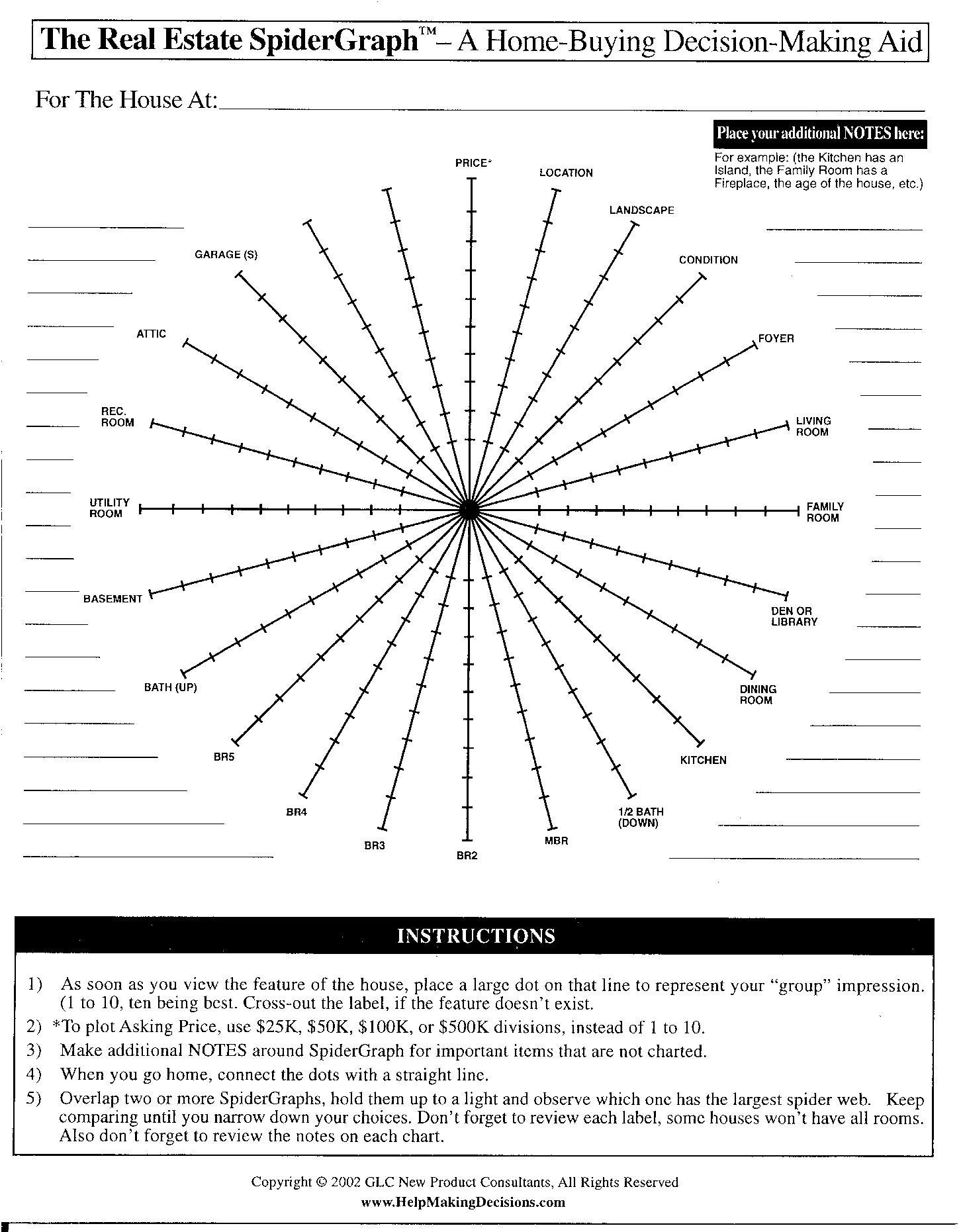
A new "Standard Features Chart" (SFC) is constructed and labeled by the user, for each new decision being made. This SFC is duplicated and used as "a common comparison base" for each item's chart, which when completed, will later be compared one on one to an unlimited number of like items for that decision. An item's idiosyncrasies can also be noted in each chart's margins for clarity.
All FeatureLines of each item are separately rated on a 1-10 scale, and plotted on its own duplicate SFC chart.
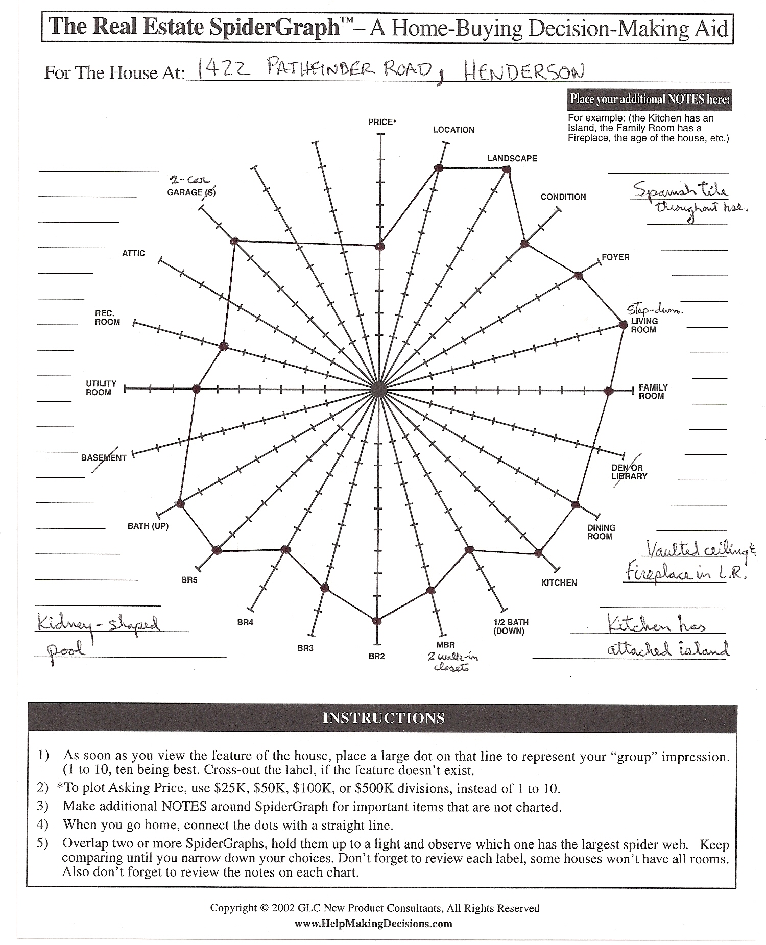
The plotted Rating Dots on all FeatureLines of that item are connected in series, with a straight line, giving it a spider-web-like appearance, to make the charts easier to read and compare. It is at this point, that an SFC chart for the item, becomes a SpiderGraph chart of that item.
The rated FeatureLines on each item's SpiderGraph chart are totaled and the highest rating SpiderGraph charts will be visually verified by the user to find the "best choices" and from that result, the final Trade-off Decision is selected.
A Charting Style Timeline
- 1877 "Polar diagrams" and "star plots" (aka Radar charts) by Georg von Mayr, Germany (1841–1925)
- 1985 SpiderGraph, papers by G.L. Chester
- 1985 Microsoft Excel (Radar spider charts)
- 1997 Microsoft Excel 97 Chart Wizard.
SpiderGraph chart vs. Radar (spider) chart
The SpiderGraph chart and the Radar chart (aka spider chart) are both circular charts, with equi-angular radii, looking like spokes of a bicycle wheel, while they may look alike, they perform different functions to arrive at their trade-off decisions. Unfortunately because they may look alike, they are sometimes confused, see Section "References of Radar chart Naming Confusion."
The SpiderGraph chart was developed as a simple paper & pencil charting & selection method, to be constructed and plotted by the user. Microsoft on the other hand, independently developed Excel software to display Radar (spider) charts, constructed from a data worksheet or spreadsheet that is arranged into category columns and rows of plotting data by the user.
The SpiderGraph chart plots FeatureLines for only one item per chart. This is done for ease of FeatureLine direct measurement, calculation and visual verification or when comparing it one on one to other items' SpiderGraph charts for that particular decision. Each FeatureLine on the chart is for a different feature, therefore, there are no relationships between any of the plotted Rating Dots on different FeatureLines of that item. Consequently, no comparisons are possible from just one chart. The SpiderGraph Chart permits plotting up to 30 quantitative variables.
The Radar spider chart displays aggregate values of multiple data series patterns. The results of "grouped data" are displayed on "one chart", and used for "visually comparing and evaluating" the many shapes' areas or sizes of the plotted variables to reveal data relationships. Sometimes, color is used to differentiate between different (category) sets of data. The Radar spider chart can plot about 8 or 9 variables before trade-off decisions get too complicated to visualize or estimate.
Comments from College Educators
In January 2007, Dr. Nicholas H. Lurie, Ph.D and Dr. Charlotte H. Mason, Ph.D, Assistant Professors of Marketing, from the College of Management at the Georgia Institute of Technology and the Kenan-Flagler Business School at the University of North Carolina, respectively, presented a paper to the AMA (American Marketing Association) entitled, "Visual Representation: Implications for Decision Making."
- In their paper,"they mentioned that Visualization Tools have the potential to offer managers and consumers ways to improve efficiencies, reduce costs, gain new insights, make data more accessible, and increase satisfaction." At the same time, the possibility for inappropriate application exists. In particular, because "the raw data is processed" to create the visual representation (just like the Microsoft Excel Radar charting method) biases in decision making May Be accentuated.
Comments from IDC Manufacturing Insights
From a presentation that was given by Mr. Joe Barkai, Research VP, Product Lifecycle Strategies in February 2010, entitled "Visual Decision-Making: Visual Information for Effective Collaboration in Product Lifecycle Management," he stated that:
- "Designers and manufacturers of complex products find it increasingly difficult to make effective product-related decisions. Increased technical complexities in many spanning enginering disciplines, elongated and dynamic multi-lingual supply chains, a growing shortage of experienced workforce, and relentless time and budgetary pressures have contributed to a complex environment that challenges the traditional means and methodologies by which companies make decisions."
- "A natural and effective manner to address these obstacles is to use Visual Information as a way to communicate across barriers and level the playing field for all participants."
Comments from initial Trade Magazines
The following are some of the original Trade Magazine Congratulatory Comments for The PLC Industry product manager that first designed the SpiderGraph chart:
1) "PLC pioneer weaves a comparison web" from The PLC Insiders Newsletter.
2) "How to pick a PLC" from Plant Engineering Magazine
Additional reading
- "Introduction to Decision Making" by Execution for System, Inc. 17th Feb. 2011 (http://www.exforsys.com/career-center/decision-making/introduction-to-decision-making.html)
- "How to Make Decisions Effectively" by Execution for System, Inc. 21st Nov. 2008 ( http://www.exforsys.com/career-center/life-skills/how-to-make-decision-effectively.html)
- "Self-confidence in Decision Making" by Execution for System, Inc. 19 April 2007 ( http://www.exforsys.com/career-center/self-confidence/self-confidence-in-decision-making.html)
See also
- Automated decision support
- Consensus decision-making
- Data visualization
- Decision analysis
- Decision engineering
- Decision-making
- Decision-making software
- Decision support system
- Emotions in decision-making
- Enterprise decision management
- Multi-criteria decision analysis
- Visual analytics
References of Radar chart Naming Confusion
- "Spider Graphs: Charting Basketball Statistics" by Roger Pimentel (http://howtowatchsports.com/spider-graphs-charting-basketball-statistics)
- "Lakers-Magic: Spider Graph Follow-up" by Roger Pimentel (Analyst), June 4, 2009(http://bleacherreport.com/articles/192050-lakers-vs-magic-spider-graph-follow-up)
- "Analysis Now Includes Spider Graphs" by OldSchoolValue.com(http://www.oldschoolvalue.com/blog/investment-tools/analysis-now-includes-spider-graphs)
- "AeroGrow vs.Coke: Spider Graph Analysis" by Jae Jun(http://seekingalpha.com/article/108145-aerogrow-vs-coke-spider-graphs-analysis)
- "Free Online Graph Paper PDFs"(under Circular & Polar, Spider Graph Paper is listed). (http://incompetech.com/graphpaper)
- "Rotokawa Cattle Company: Spider Graphs & Linear Measurements"(http://www.bakewellrepro.com/spidergraphs.html)
- "Keep Radar Graphs Below the Radar - Far Below" by Stephen Few, PE Consulting Company (http://www.perceptualedge.com/articles/dmreview/radar_graphs.pdf)
External links